|
In progress: 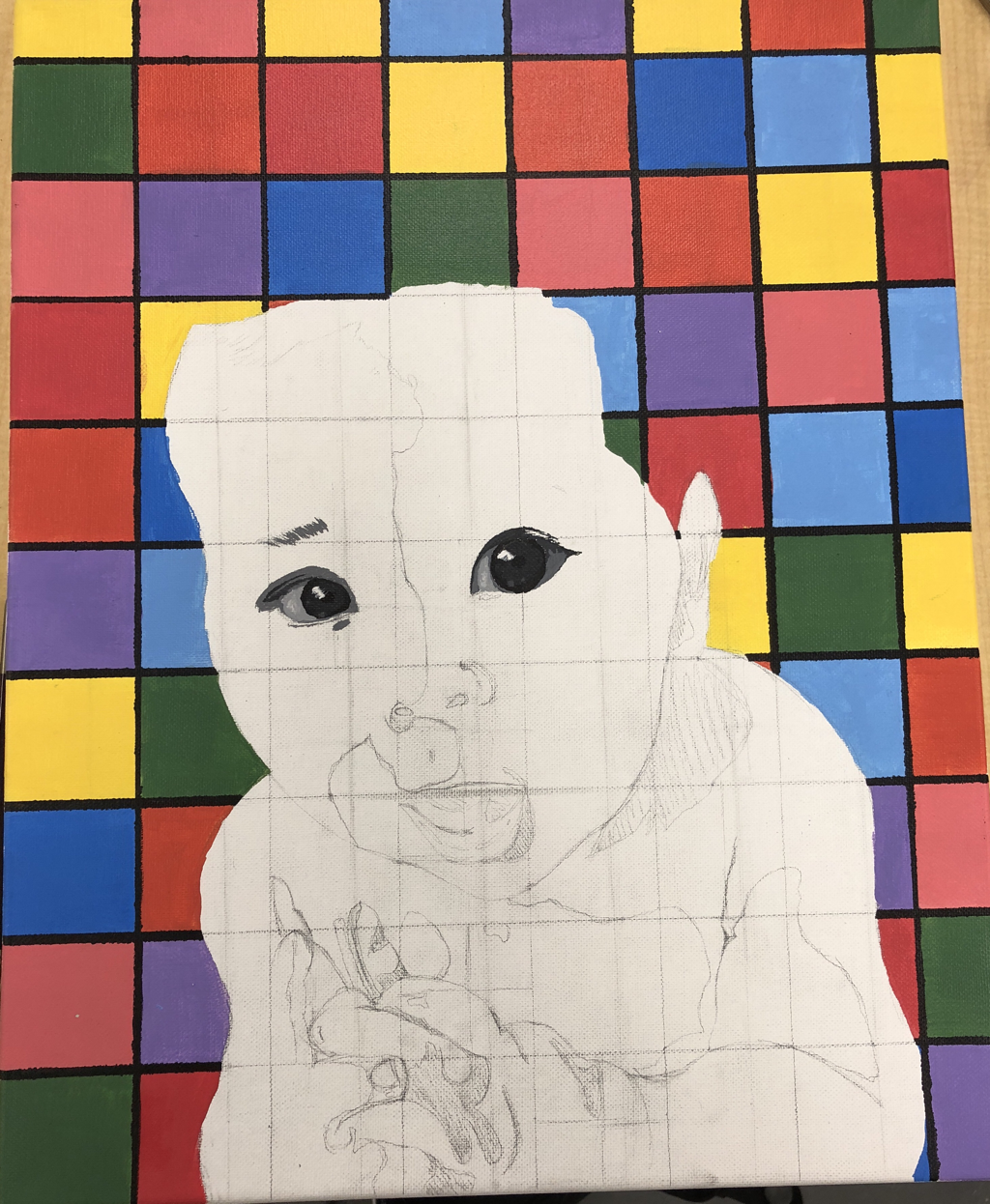 Final Piece: 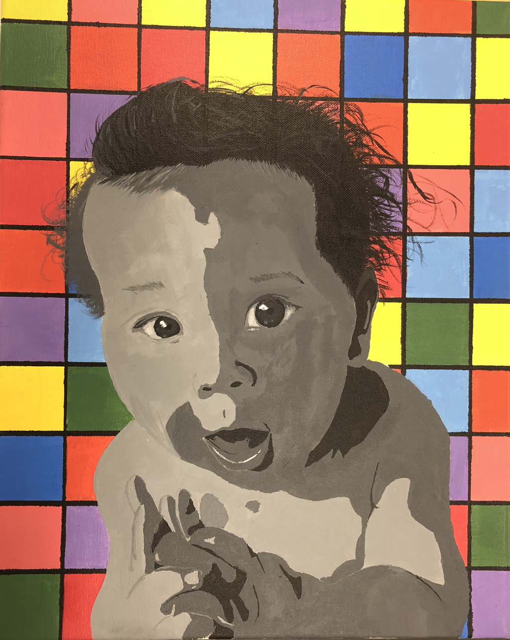 1. I did a portrait of my baby brother Landon
2. I used Acrylic paint on a canvas 3. I first printied off a picture that I edited, and gridded it. I then gridded the canvas to the same proportions. After grinding I sketched the picture of my brother, excluding his hair. After sketching I painted all the blocks outside of him a different color. To make the boxes look more precise i painted black lines along the sides of the boxes. Then I started painting him, I started with the lighter values and worked towards the darker values. once done with everything on his face and body I added the hair. 4. I found everything pretty successful especially the gridding, if I were to do this again I would probably do the hair differently.
0 Comments
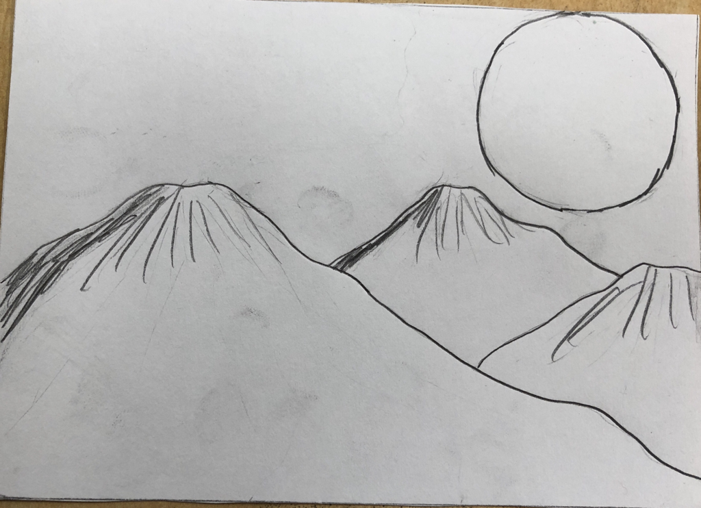 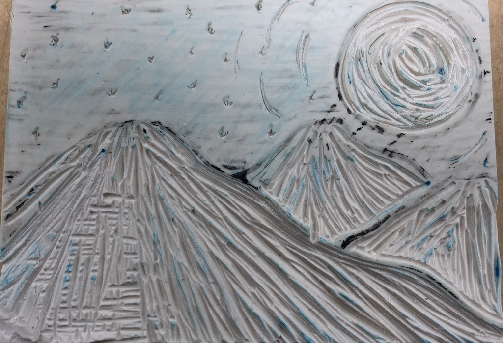 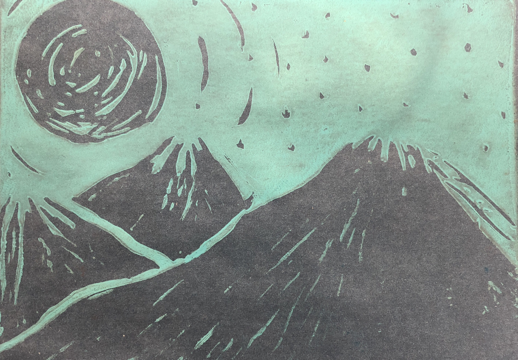 1. My piece shows the idea of line because there are lines in the mountains and lines in the moon, there are also lines outside of the moon to show that it is reflecting light. The lines add much needed value to the piece.
2. My piece was successful in showing the lines that i meant for it to show, but i would change the fact that i cut the lines in two directions in one part of the mountain and that resulted in no lines showing up in that part. I was successful in creating crisp lines in the finished piece. Another thing I wish i did differently was i wish i was more patient and took time while stamping it, and i wish i chose different colors for the final piece. 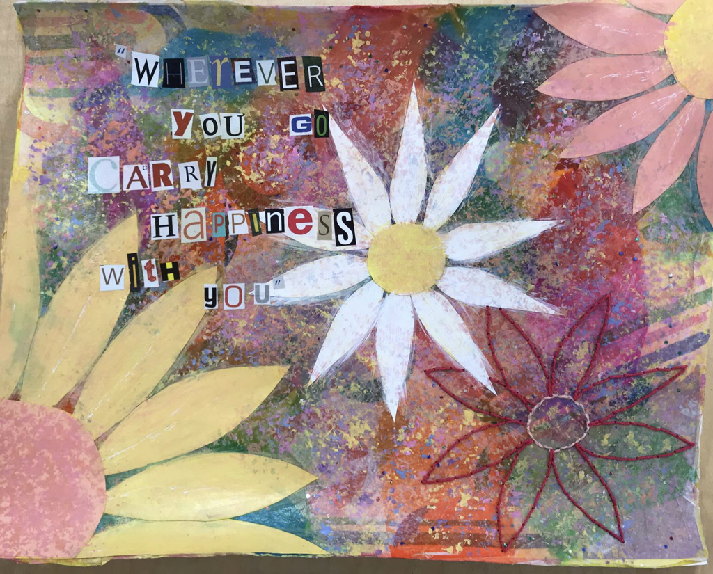 1. I used 5 different techniques and mediums -the first was tissue paper and the gel medium -the second was paper glued on top in the shape of flowers -the third was acrylic paint stamped with a sponge onto the background and the center of the flowers -the fourth was cutting out letters and using them to write out a poem i found with gel medium -the fifth was sowing in the shape of a flower 2. My word was my thoughts, and i was very happy and i like flowers so i added those and the poem represents my happiness. The color scheme, which is bright and happy colors, which helps portray my happiness 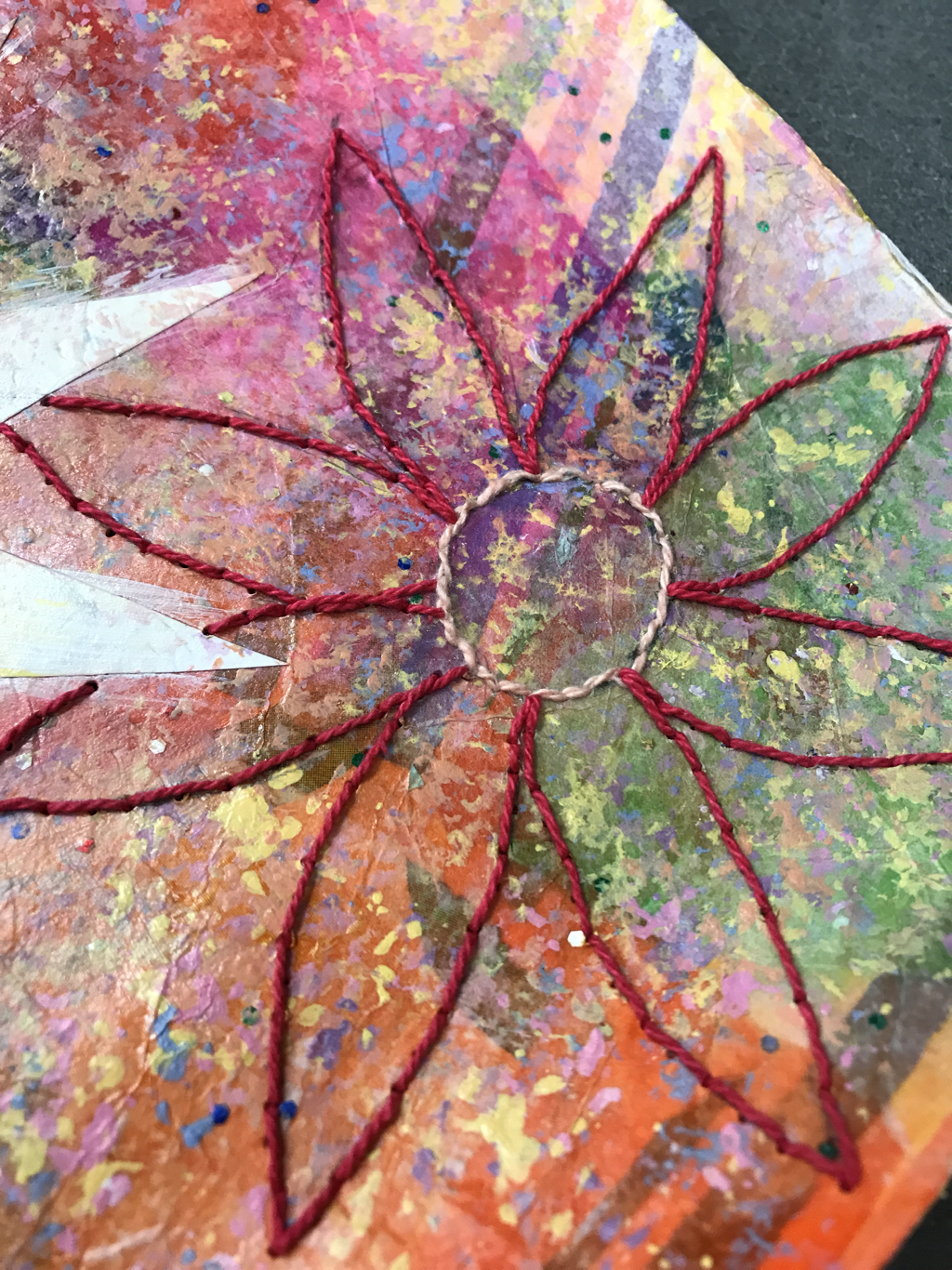 In-Progress post: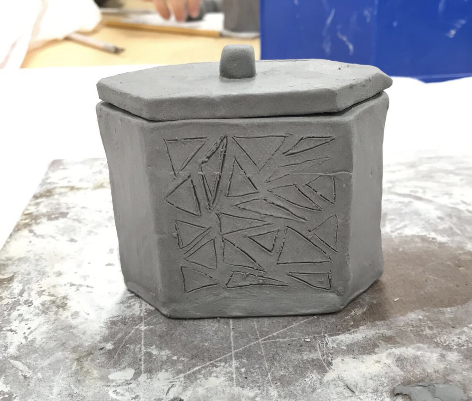 1. I plan to cut out the triangles that i etched into the sides of the box. The lid will lock into place by having two notches that lock into the box. I want to glaze my box with two different colors, depending on which glaze colors we have. 2. The most difficult part of the piece was cutting out the triangles without ruining the entire side. 3. The walls that I put together stuck together really well and didn't break or crack at all. 4. I started the project by rolling out a piece of clay to create a slab, then used a stencil to cut out the shapes of the walls, the bottom and the top. To stick the walls together to form the box I scratched and slipped the edges of the walls and stuck them together. Then I cut out the triangles in the walls and that was my finished greenware. After that, the piece was bisque fired. Finished Piece: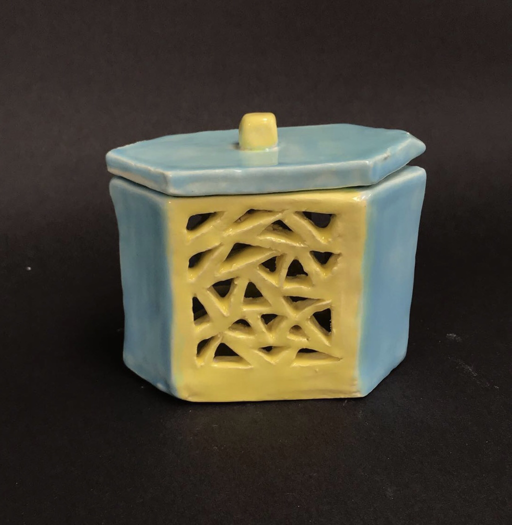 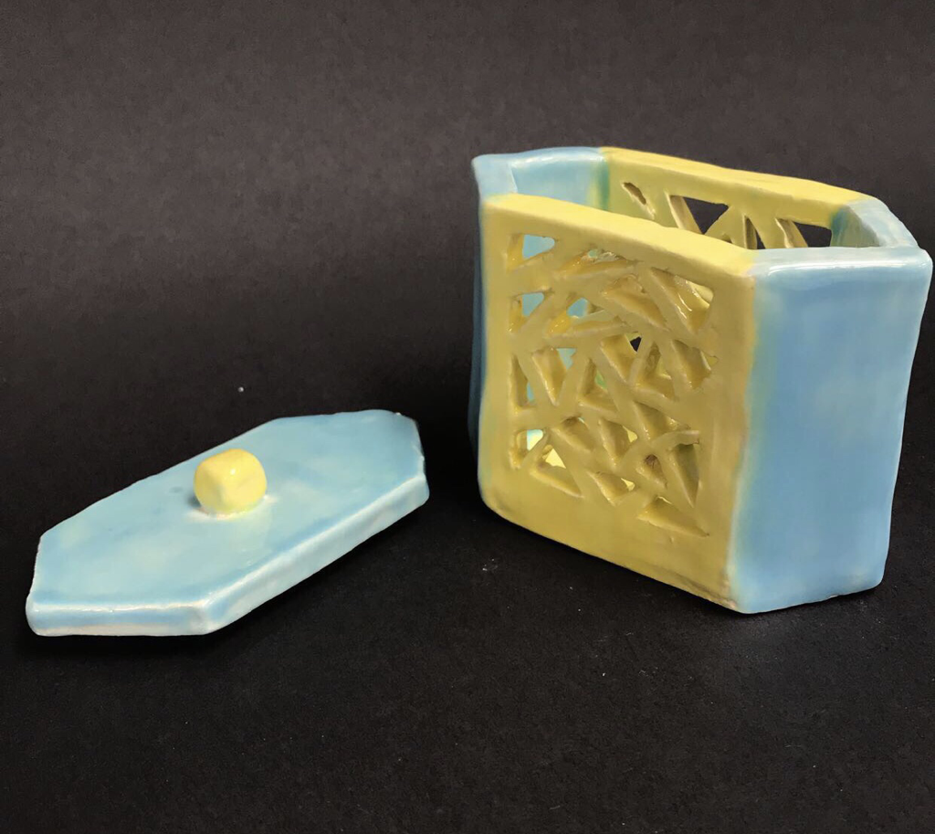 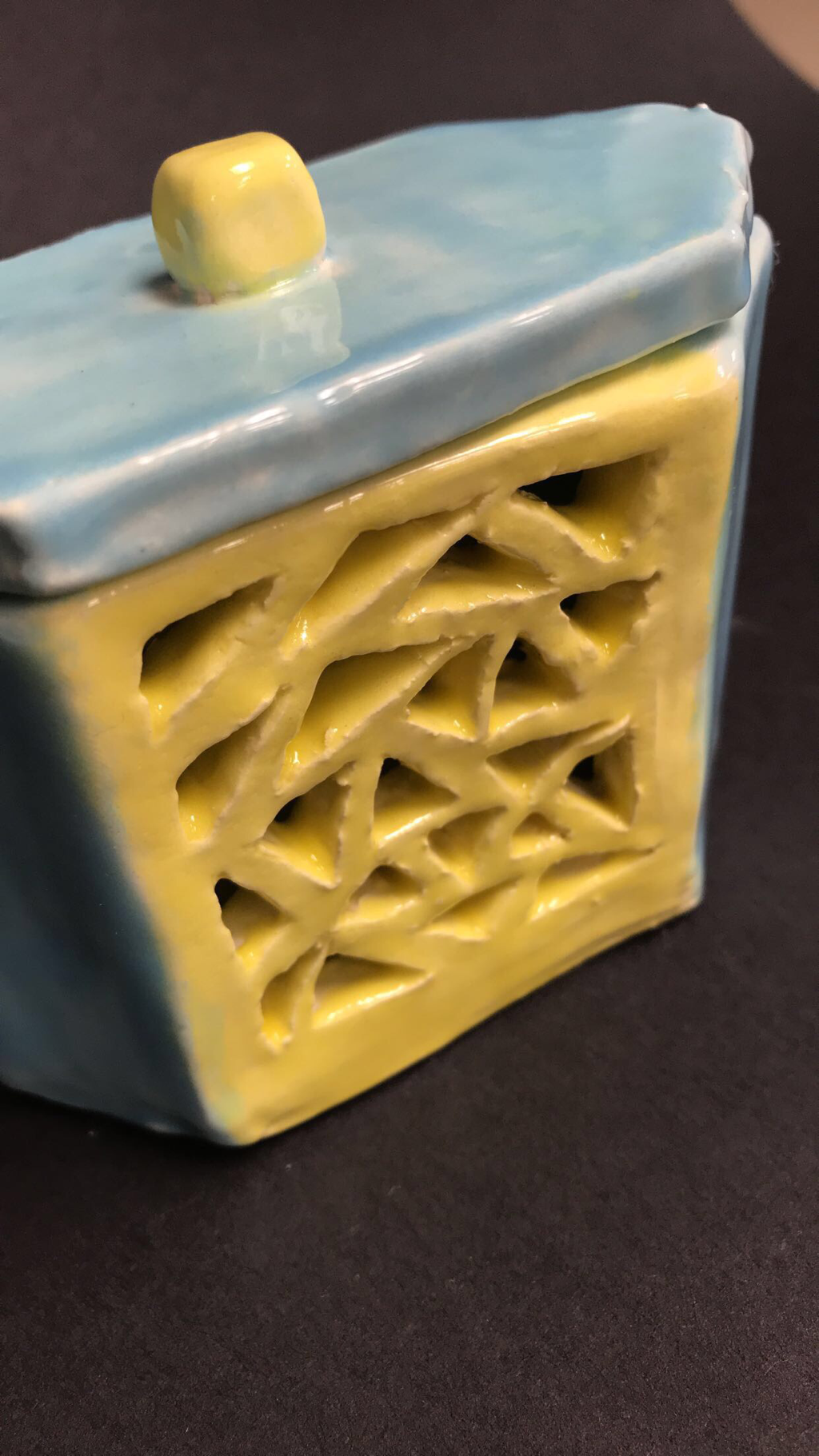 1. From my in progress post until now, i have cut out the triangles, fired, glazed and fired again.
2. It didn’t stick together while firing. 3. Glaze it more evenly, and make it a bit bigger. 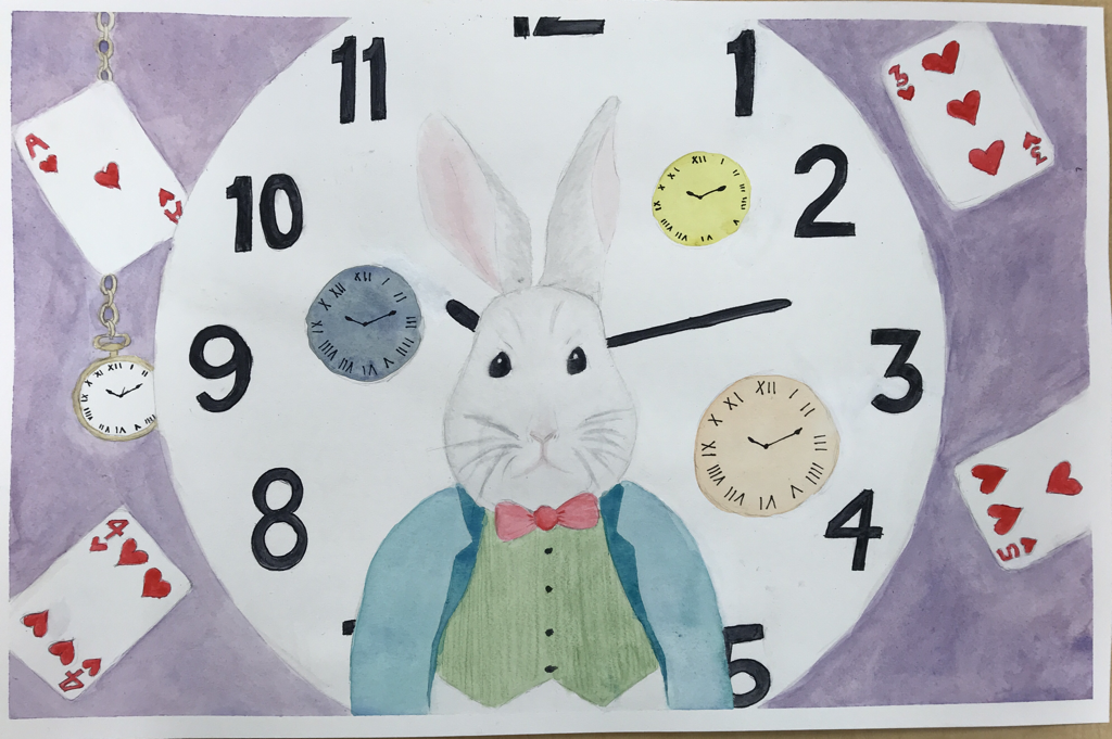 Finished piece 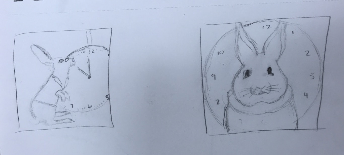 Sketches 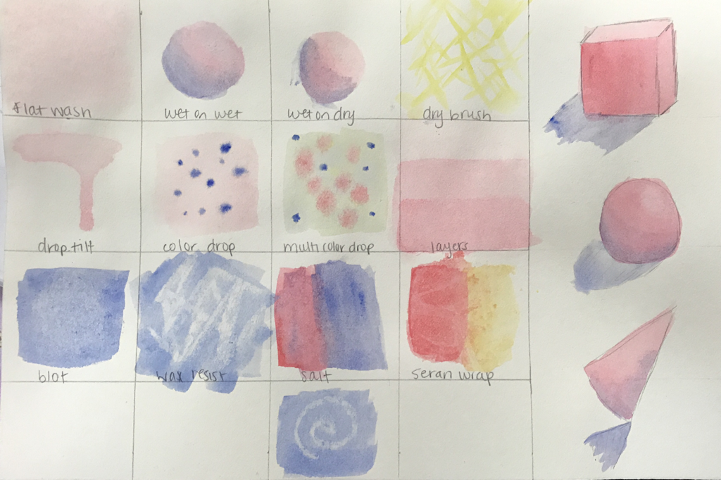 Most helpful warmup 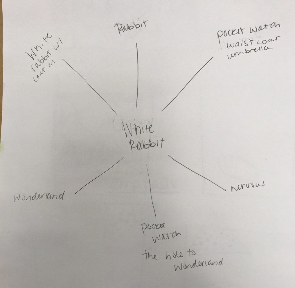 Mind map 1. I recreated the White Rabbit from “Alice in Wonderland”
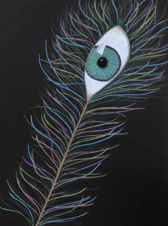
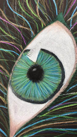
2. I made the rabbit less human looking and also made him wear more vibrant colors because wonderland is bright and crazy 3. I worked from the back to the front, so I started with the purple background and finished with the rabbit. Some advice would be to start with the lighter values rather than starting in a certain area like I did. 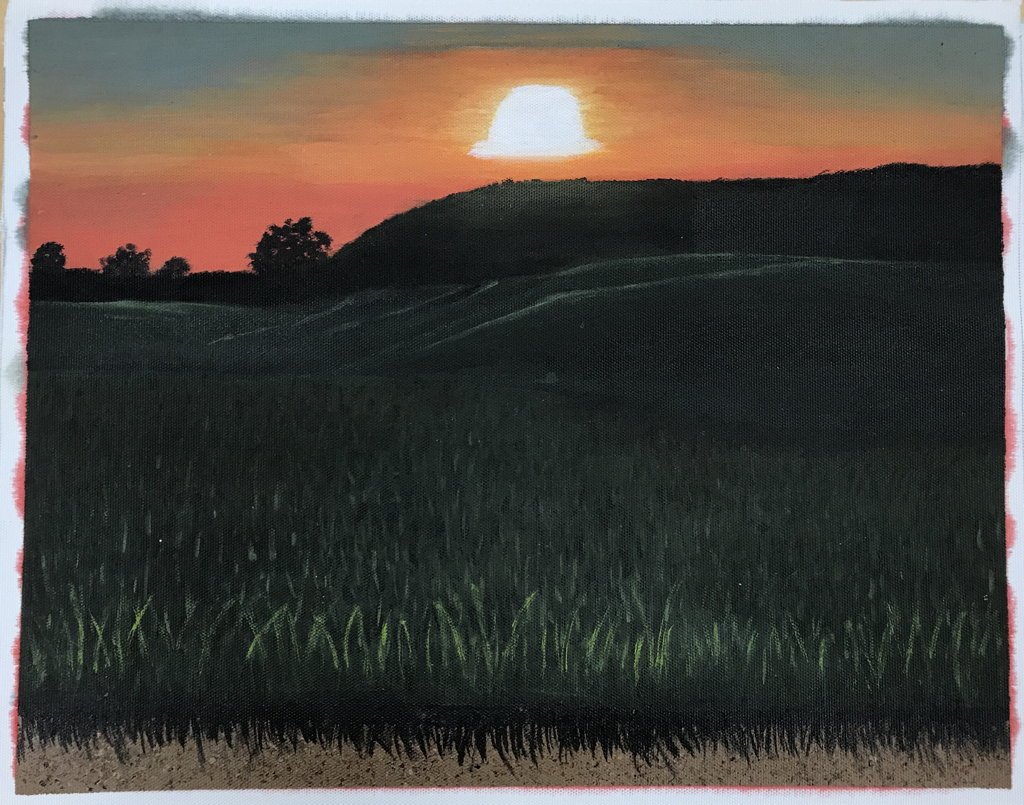 The place I chose for my piece is a mountain in the Berkshires, MA. I used to live near here and my friends and I would always go and watch the sunset here and just hangout. This place is associated with good memories and laughs with good people and brings happiness to mind. 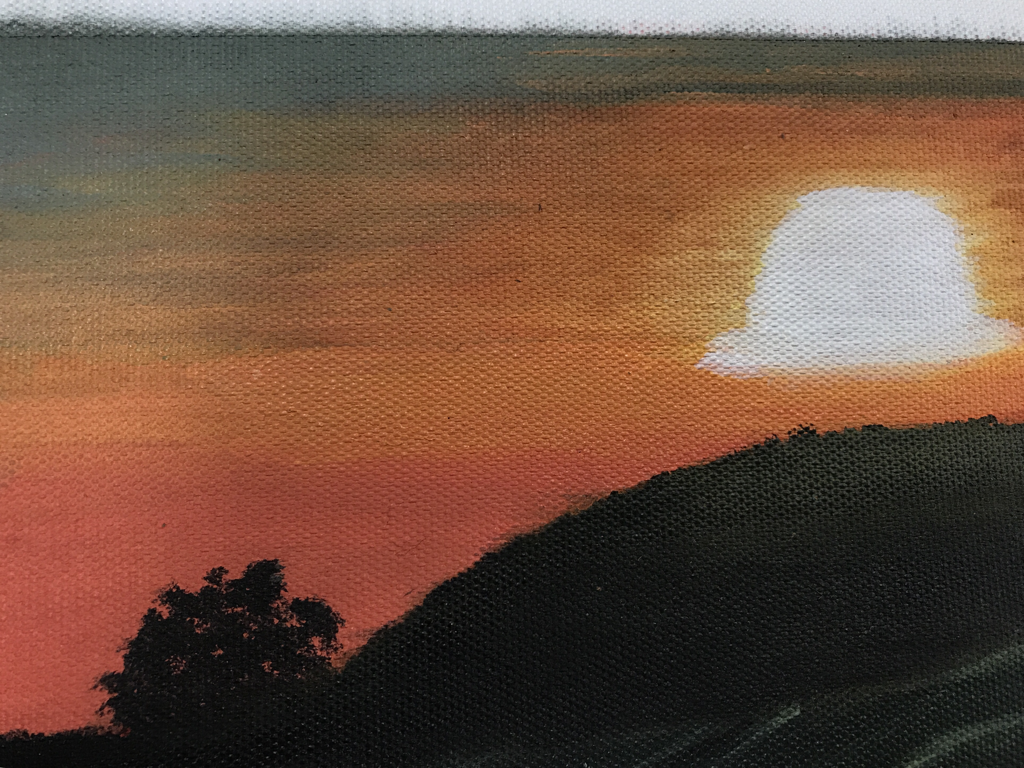 The most difficult and most successful part of my piece was definitely the sunset. It took me 2-3 class periods just to finish that aspect of the piece. It took me a while to actually get the hues of the colors as close as I could to the actual picture, and once I did that it was even harder to blend the colors on the canvas to make it look natural. 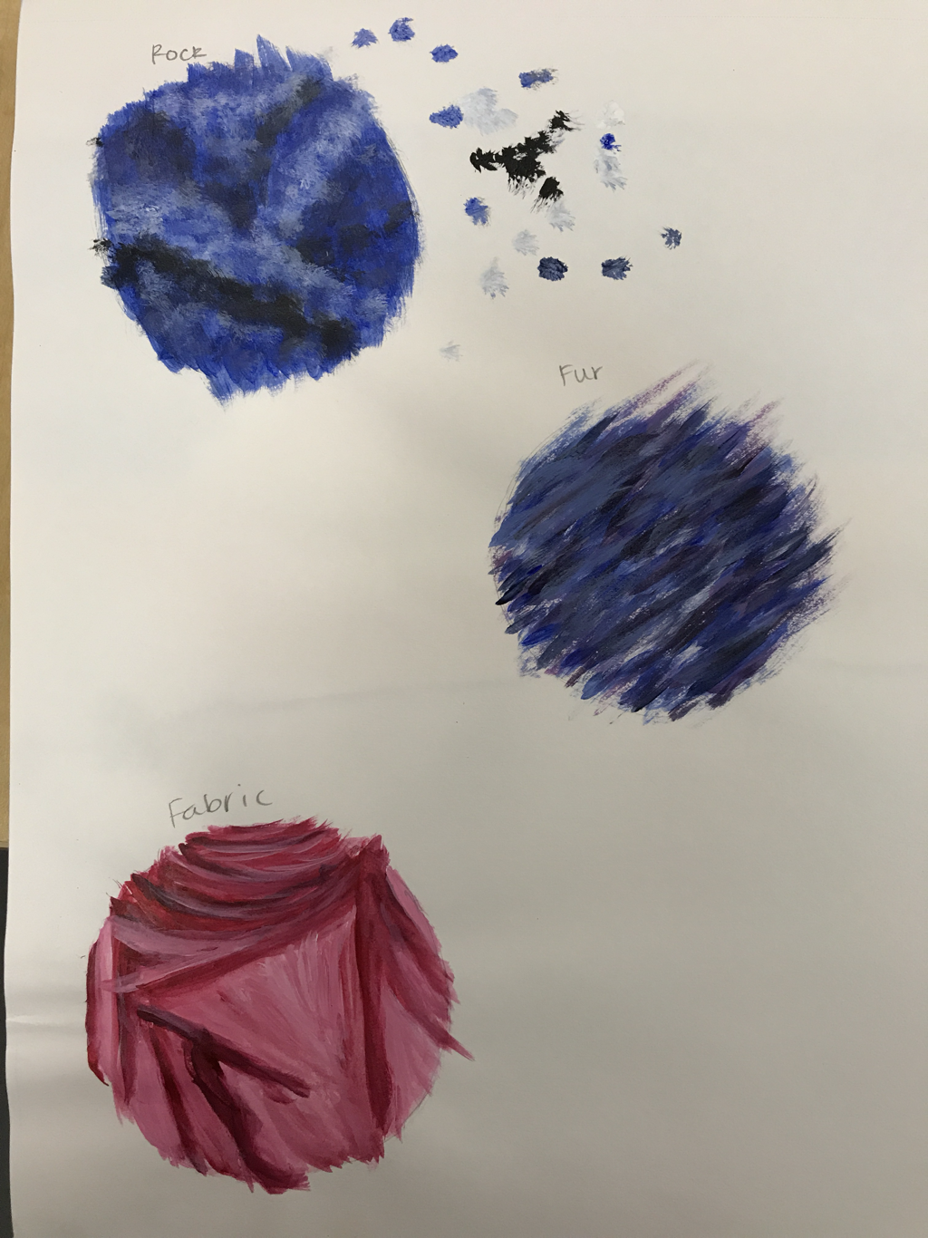 The most helpful exercise we did was definitely the texture warm up. I used many different textures in my piece so this came in handy for me. 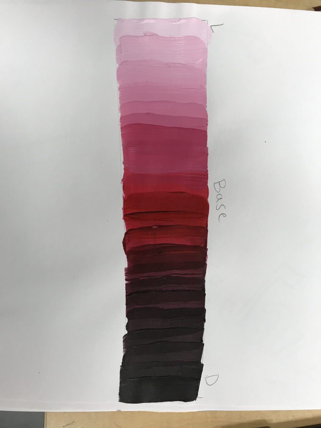 I learned that mixing colors is a lot more difficult than I thought it would be. And once the paint dried it actually dried a shade darker. 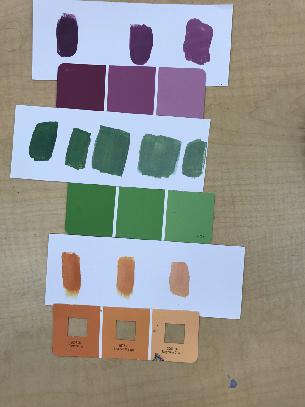 We made brown by mixing complementary colors, and to get lighter shades, we just added white. 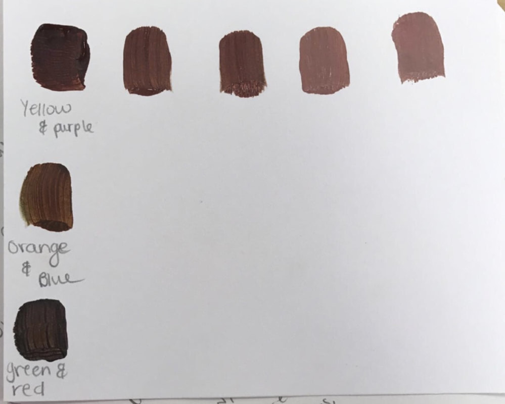 For this two-in-one project I chose to combine a human eye and a peacock feather.
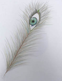
I chose to use colored pencils as my medium because I definitely wanted to work in color for my piece to include certain details that wouldn't be visible if it were in pencil, charcoal or pen. Plus, since the eye had very precise details and the feather had to be made up of a lot of thin lines, I thought colored pencils would be the easiest colored medium to work with. 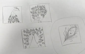 Thumbnail sketches Thumbnail sketches At the start of the project I basically just thought of 20 random items and started pairing my favorites together and finally ended up with the peacock feather and an eye idea. At first I thought maybe I would draw a full peacock and every feather would have an eye in it, but if I wanted to include all the details I planned to, then the piece would have to be much bigger than the size we were trying to have it, so I finally chose to just draw one feather with the eye.
Today we met with our AP Art mentors, and my mentor's name is Katelyn Lombardo. She is a senior and she enjoys working with prisma colored pencils and oil paint out of all the mediums she has worked with.
Something I think I could benefit from meeting with Katelyn and talking about both of our works and her critiquing mine, is how to take constructive criticism and change my work for the better. From the advice I was given, I am now aware that i should take my time with my pieces, and include as much detail as possible, especially when it comes to value. I learned that I need to include extreme values (making the dark values very dark and the light values very light so the pieces look less flat). And i could definitely work on my blending technique. It was also really cool looking at Katelyn's progression from Art I to AP, and seeing her personal style change and come out through her pieces, it gives me inspiration that with enough hard work and time dedicated to working on art pieces that I can also get better and improve on my art as well.
To see some of Katelyn's work since Art I visit her blog here. So far in class we have done multiple different warm-ups, such as spheres, to practice shading and highlighting with different types of mediums, pen cubes, to work on different values with pen drawings, and a blind contour face, to work on drawing what we see rather than what we know. 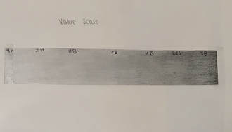 The most useful one that we have done in class was actually the value scale. The reason why I found this to be the most useful so far is because I really like drawing with pencils, and learning how to use each drawing pencil and having a reference to the shade of each pencil and learned how to blend properly. This also sort of helped with learning to blend charcoal. What the value scale did was teach us how to work with the different shades of pencils, value of a piece of art is the lightness and darkness of tones or colors. It adds depth and make the art piece look more realistic. We were also introduced to composition, which is the placement or arrangement of visual elements in a work of art. So it is the literal placement of actual objects in an art piece. This helps make the piece look more original and have a more unique look that the artist creates. So far in class we have used multiple different mediums such as pens, pencils, and charcoal and discovered pros and cons of each. Finally for charcoal  For pens, a pro would be the fact that there are very fine points on the pen for detail and the fact that you can get very different contrasted values, a con would be the fact that you cannot erase it.  For pencils, a pro would be that it can be erased and blended, making it easier to work with, a con is that it doesn't show contrast as well as other mediums.  Finally for charcoal, a pro is that if a mistake is made, it can easily be blended away into the background, and some cons are that it can get very messy and you have to use different types of charcoal to achieve the right contrast.
|